
I don't know what to make of Shepard Fairey. He's "made it," there's no doubt about that. He's affected American culture not once but twice, first in those ubiquitous Andre the Giant 'OBEY' stickers in the late 80s (which dotted the levels of a Tony Hawk video game not too long ago), and more recently, of course, with the Barack Obama 'HOPE' portrait that defined the 2008 presidential election and went on to become the basis of a Facebook app. That latter portrait now hangs in the National Gallery. Whatever else he may do, Fairey's place in history is secure. In today's fractured, internet-driven culture, that is tremendous.
But what of the work itself? For the Obama picture, memorable though it was, is well in keeping with Fairey's style: a bold, stenciled image of a famous person made with two or three complementary colors over a newspaper college backdrop, with an occasional message (often 'OBEY'). Take the grandeur of Soviet Realism...

...Warholian distancing...

...and street art minimalism;

...mix them together and you've got a reasonable summation of the Shepard Fairey style.
The result, much like 'HOPE,'is visually arresting and usually has something to say. These are both virtues. The problem, with, say, the Young British Artists like Damien Hirst and Tracey Emin is that quite often their work is ugly and pointless and is only art because they say it is. Fairey's very good at what he does, and he's not out to scam millionaires and art snobs, and for that we can be glad.
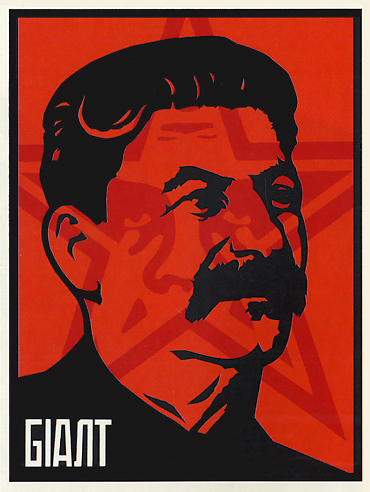
What vexes me is the contradiction that runs through this style. The art very consciously appropriates the grandiloquent kitschiness of communist propaganda and takes the piss out of it, but instead of being a joke on its subject, like the 2005 Stalin piece above, or a joke in itself, like his Andre the Giant, it often goes on to make a sincere political statement, or at least imply one. Irony and earnestness thus mingle uncomfortably, even in the portraits without big words.
It's self-defeating. Andy Warhol always denied any deeper meaning to his work ("There's nothing behind it."); the superficiality, the product of a then-new mass-produced culture, was exactly the point. What to make of the obvious affection (note the dove and 'WAR IS OVER!' clippings) Fairey has for the Dalai Lama or John and Yoko when they are depicted in a style already acknowledged to be, and mocked for being, propagandistic?


Perhaps predictably, Fairey is more successful when he breaks from this formula (I hate to call it that, but what else could facilitate such prodigious output?). The first, smaller, room of the Deitch Projects MayDay exhibit that I caught during my New York trip--which coincided with Free Gallery Week--features three pieces that are not portraits, and, while perhaps not as handsome, are more successful in their efforts. The first (unfortunately I did not get the titles) is a conscious quote of Jasper Johns' (whose portrait is a part of the exhibit) Flag, which was also painted over newsprint collage.


The second reads, "Check Your Oil|America's Favorite|Flammable Liquid."

The third, near as I can tell, is just a surfer catching a wave. Note the unusual blue color scheme.

Divorced from a style that is the basis an expensive novelty gift, their intent--and occasional message--come through far more successfully. This is also in part due to the fact that they stand apart. The MayDay exhibit consists only of work produced in 2010, most of it of the portrait variety, and there is so much that it becomes exhausting. As I said, Shepard Fairey is very good at what he does, but its effect is diminished when it is done so often. I should hope that his (further) raised profile will push him into new directions. I'm certainly interested in him enough to find out more and watch his development.


No comments:
Post a Comment